


CASE STUDY: GRIND FITNESS
FROM RUINS TO REPS
FORGOTTEN BUILDING BECOMES AN URBAN FITNESS LANDMARK
PROJECT OVERVIEW

Meet Saleema Scott — a former college athlete with a lifelong passion for fitness, movement, and community. Shortly after relocating to Atlanta for a new career opportunity, Saleema faced an unexpected setback when her longtime gym suddenly closed its doors.
Determined to maintain the style of training she loved, she explored other fitness options throughout the city, but many felt impersonal, uninspiring, or focused more on image than genuine wellness and performance.
During her daily commute, one building continually caught her attention: an abandoned warehouse she had passed countless times before. This time, however, a “For Sale” sign stood out. Where others saw a neglected property, Saleema saw possibility. She moved quickly, submitted an offer, and soon became the owner of the space that would become the foundation of her vision.
Saleema set out to transform the aging warehouse into a welcoming, high-performance fitness environment designed for real people and real goals. Her vision was to create a space that felt both personal and empowering. She wanted a gym where members could strength train, take aerobics classes, improve endurance, or simply reconnect with a healthier lifestyle. Complete with indoor training areas and an outdoor space for sprint work, conditioning, and walking, the facility was designed to support every level of fitness while fostering a true sense of community.
THE PROBLEM
During her daily commute, one building continually caught her attention: an abandoned warehouse she had passed countless times before. This time, however, a “For Sale” sign stood out. Where others saw a neglected property, Saleema saw possibility. She moved quickly, submitted an offer, and soon became the owner of the space that would become the foundation of her vision.
Saleema set out to transform the aging warehouse into a welcoming, high-performance fitness environment designed for real people and real goals. Her vision was to create a space that felt both personal and empowering. She wanted a gym where members could strength train, take aerobics classes, improve endurance, or simply reconnect with a healthier lifestyle. Complete with indoor training areas and an outdoor space for sprint work, conditioning, and walking, the facility was designed to support every level of fitness while fostering a true sense of community.

THE PROCESS


One of the first steps I took was to design a series of gears to serve as the logo’s icon. I then selected and customized a bold sans-serif typeface to match the gears’ visual weight and to provide enough stroke to integrate subtle gear-edge details.
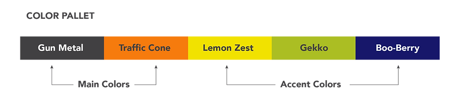
With the core layout established, I shifted focus to color. Although Saleema initially favored earth tones and industrial hues to reflect the space, we explored several palettes before choosing Gun Metal Gray paired with Caution Cone Orange. To bring additional vibrancy to the gym and its extensive signage, we later introduced a few complementary accent colors that brighten the palette while maintaining the brand’s industrial character.
THE SOLUTION
The final result was a brand identity that felt bold, modern, and unmistakably authentic to the spirit of Grind Fitness. Inspired by the industrial character of the building itself, the visual system combined strong typography, rugged textures, and mechanical design elements that symbolized discipline, movement, and transformation.

More than just a logo, the brand became a reflection of the mindset Saleema wanted every member to embrace: put in the work, trust the process, and enjoy the journey along the way.
RESULTS & REFLECTION

Since launching, Grind Fitness has grown into more than a gym — it has become a thriving fitness community. The distinctive branding helped the business stand out in Atlanta’s competitive wellness market, attracting members who connected with the gym’s welcoming but hard-working culture. From social media and merchandise to signage and member engagement, the brand created a consistent experience that strengthened both visibility and loyalty. Reflecting on the process, Saleema shared that the branding helped bring her vision to life in ways she hadn’t imagined at the beginning. “I knew what I wanted people to feel when they walked into the space,” she explained, “but seeing it translated visually made everything real. The brand gave Grind its personality, its energy, and its voice. It feels powerful, motivating, and true to who we are.”


